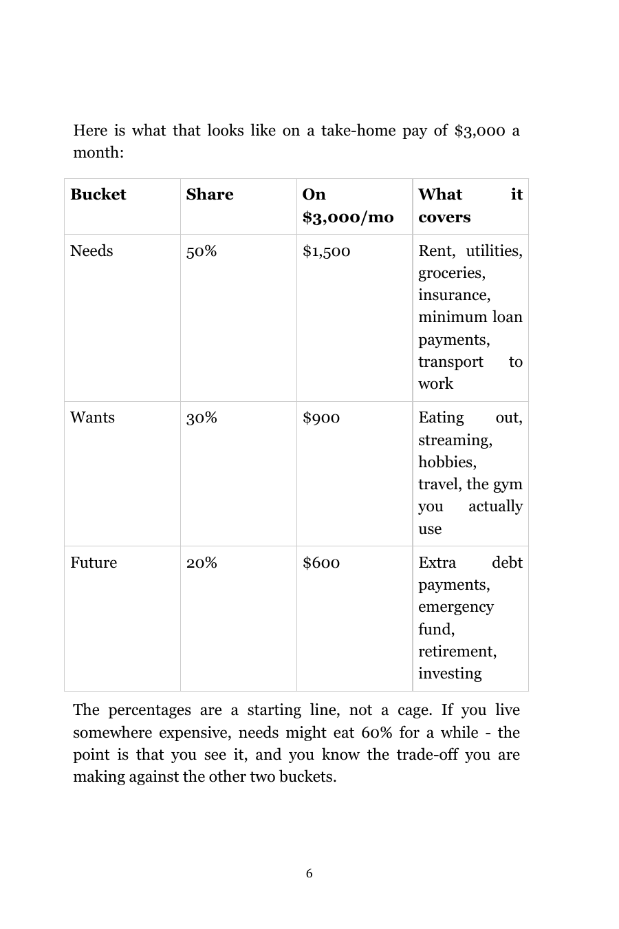
Nonfiction — complex table
8.5 × 11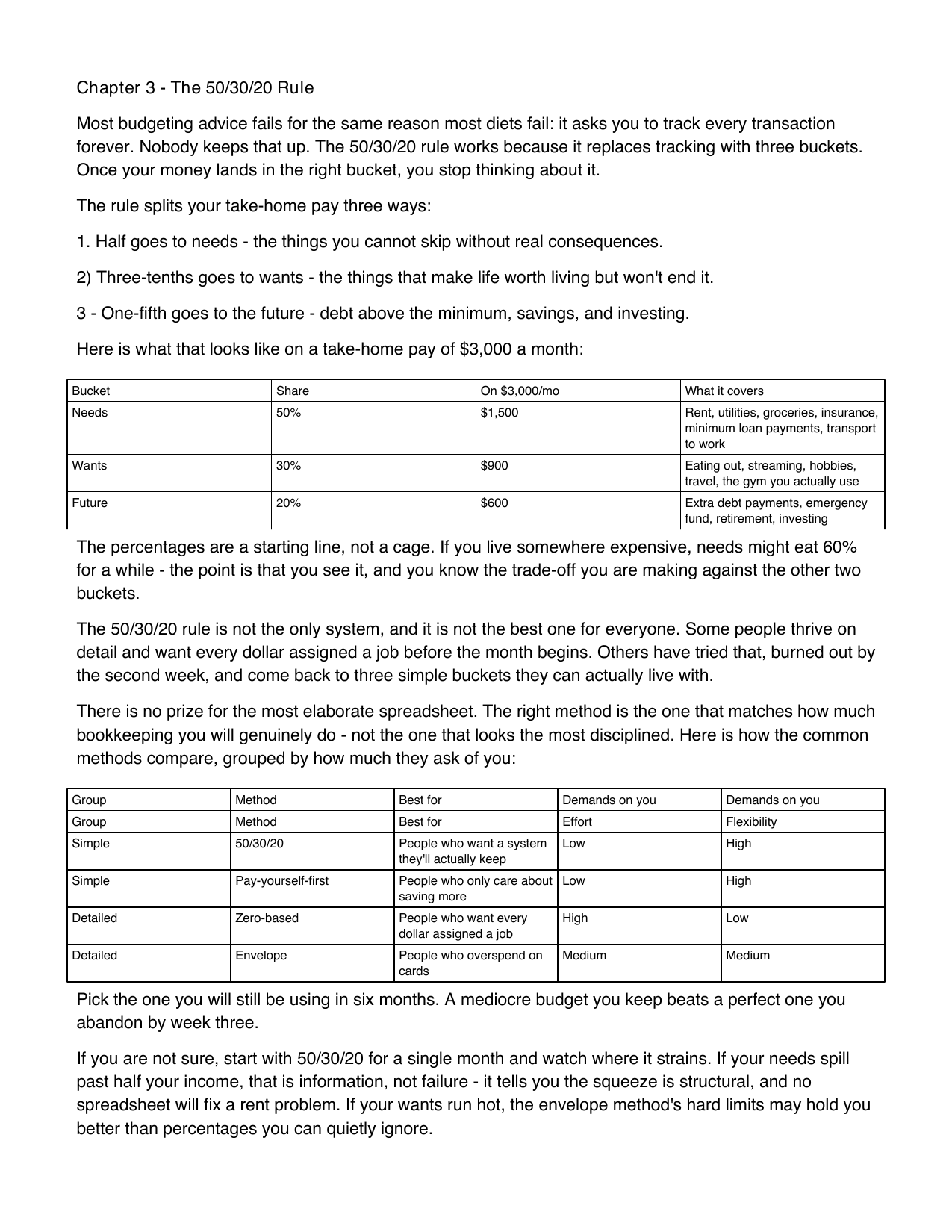
A two-tier merged-header comparison table, merges in both directions, living inside a full page of chapter text. Zero mid-word breaks — the kind of table most converters silently flatten or drop.
The difference
Every pair below is a real render straight from our pipeline — no stock mockups. Scroll to your book type and see exactly what comes back.
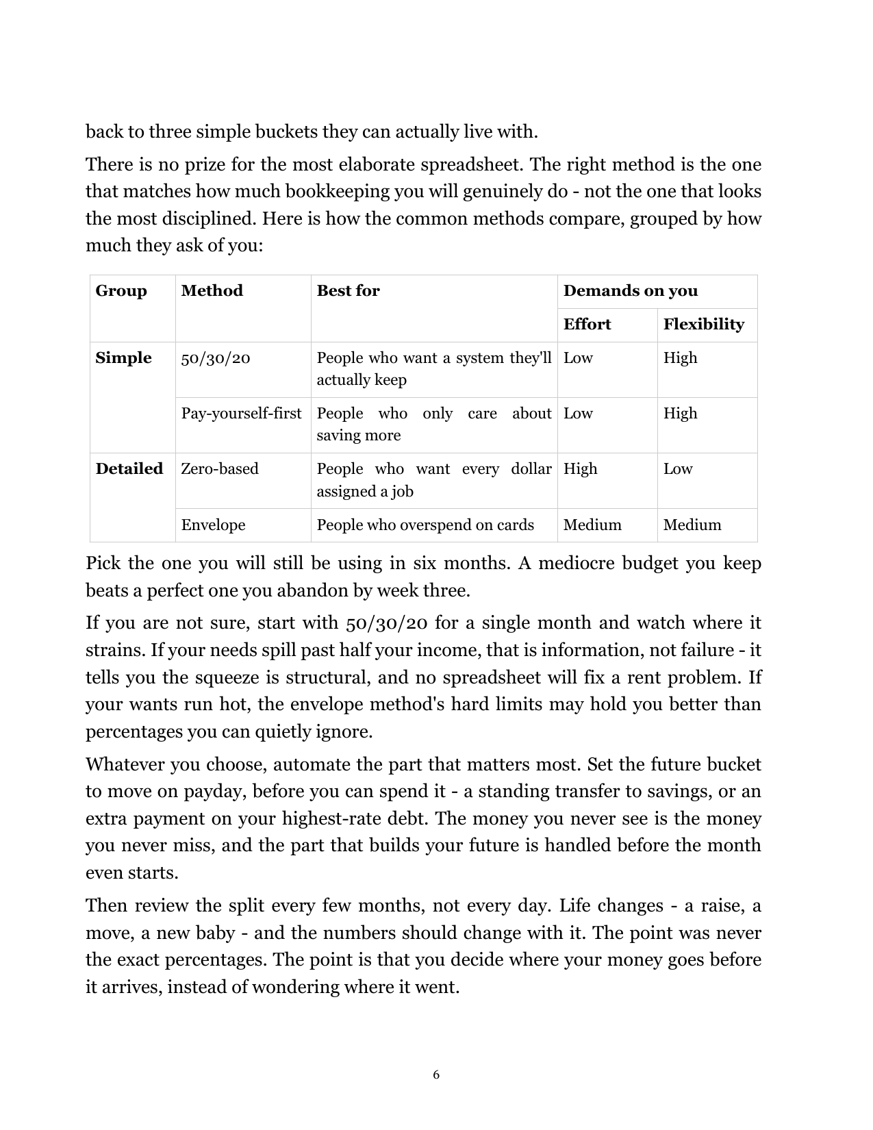
A two-tier merged-header comparison table, merges in both directions, living inside a full page of chapter text. Zero mid-word breaks — the kind of table most converters silently flatten or drop.
A clean four-column table set at trade-paperback trim, columns sized to the text block with the heading row kept attached.
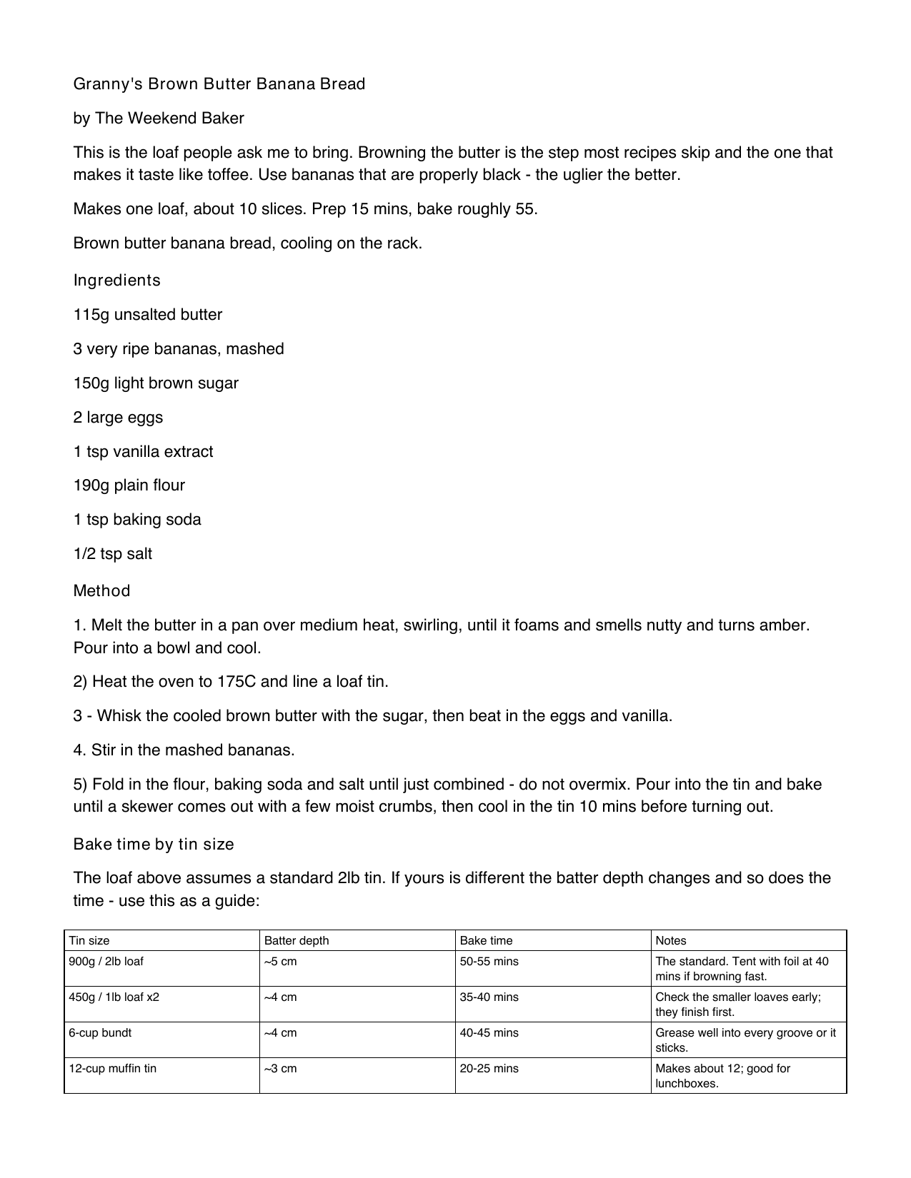
A centered photo, a Prep / Cook / Makes meta box, evenly spaced ingredients, and a real bake-time table on the facing page — not a wall of run-together text.
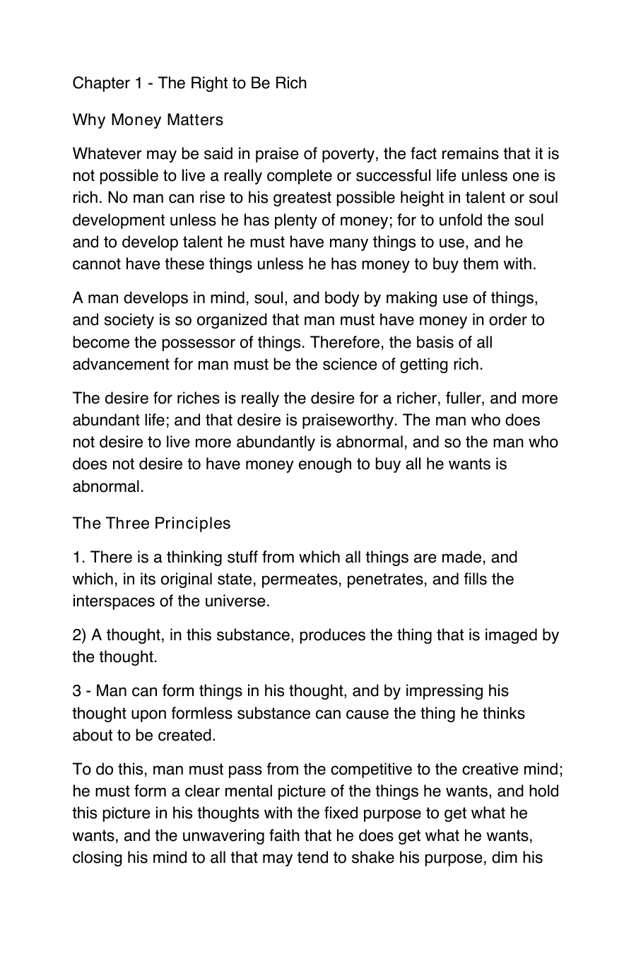
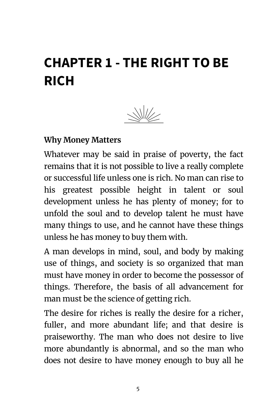
Numbered principles set as proper body paragraphs instead of the bold-italic mush a naïve Word export produces.
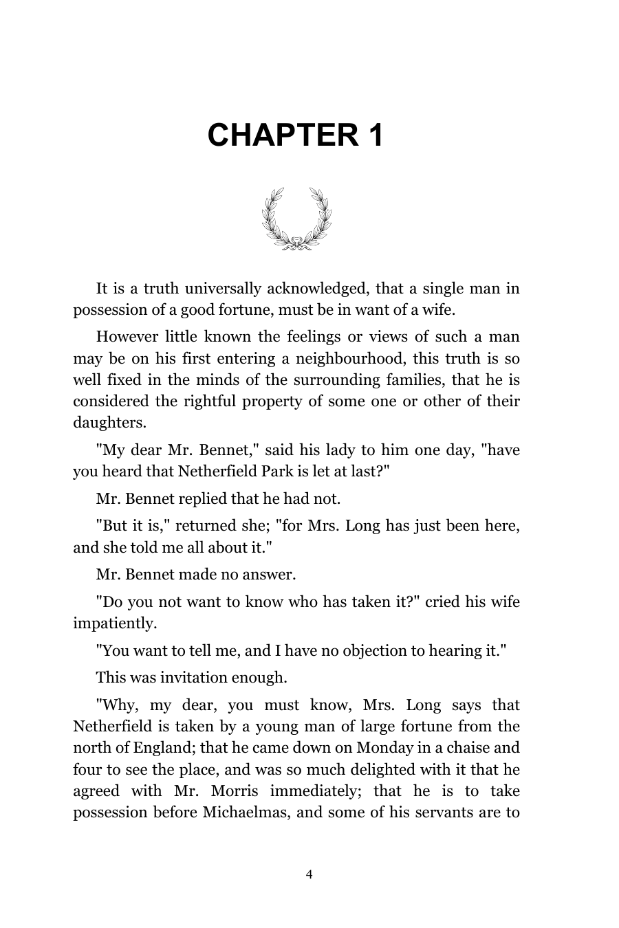
A chapter opener with a drop cap, scene-break ornaments, and first-line indents — the quiet typographic conventions that make a novel read like a novel.
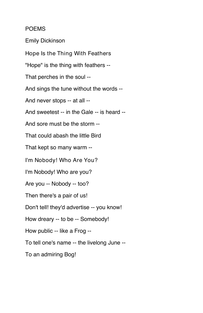
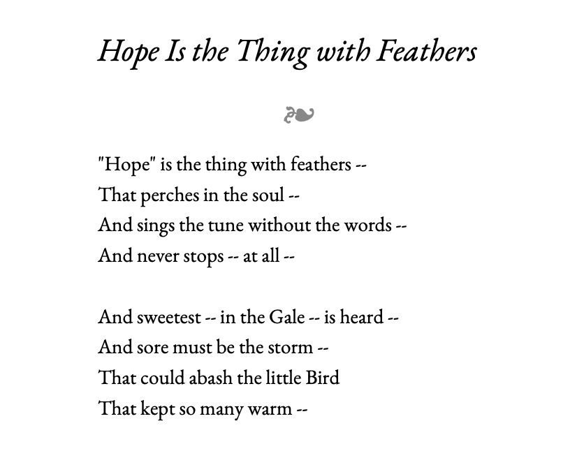
Stanzas and line breaks preserved exactly — never reflowed, every line flush to the same left margin — centered in an elegant EB Garamond serif beneath a fleuron. Choose from four styles on the order form.
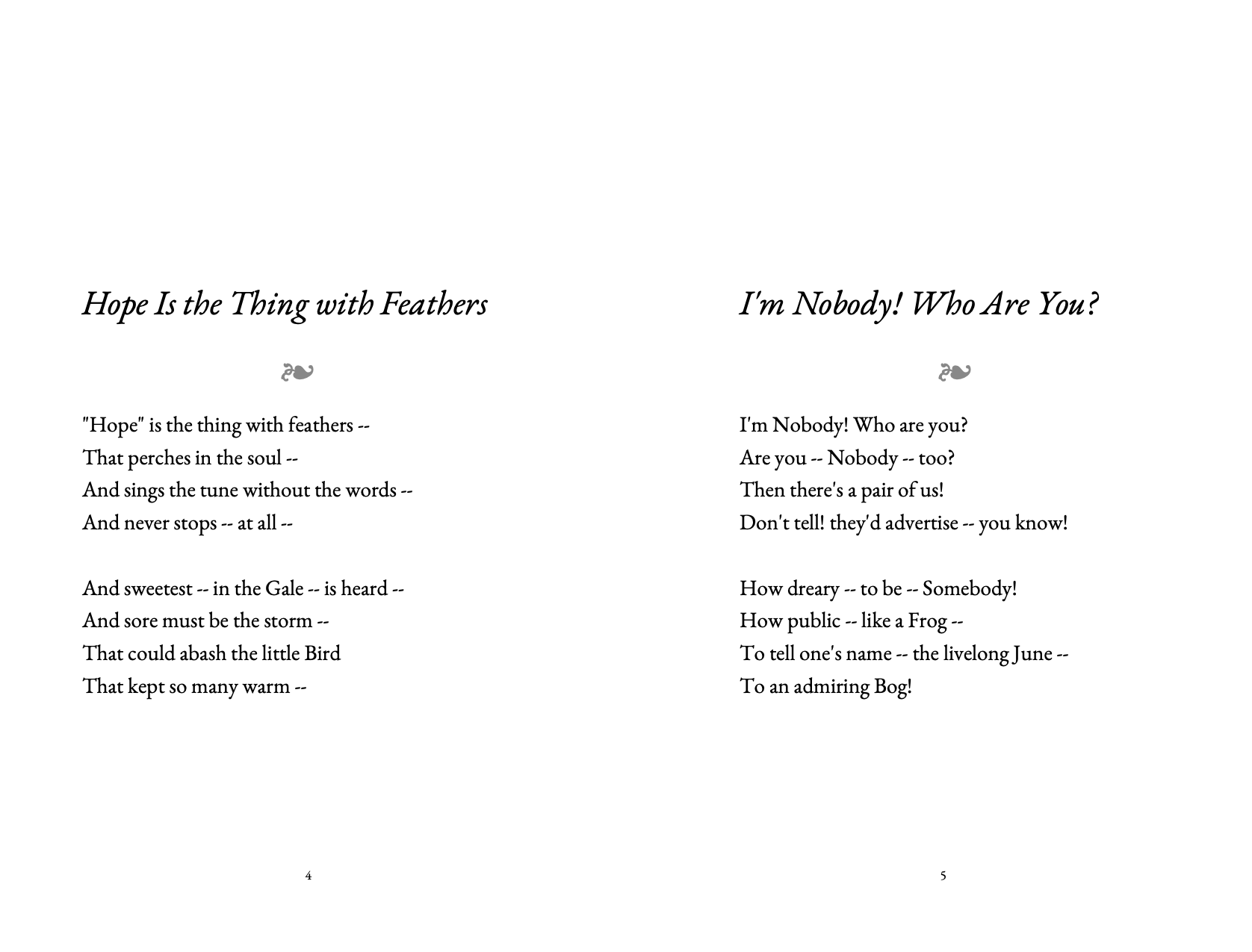
Every poem opens on a fresh page — never stacked under the one before it — so each piece gets room to breathe.
Don't see your book type? See full pricing or email hello@formatli.com.